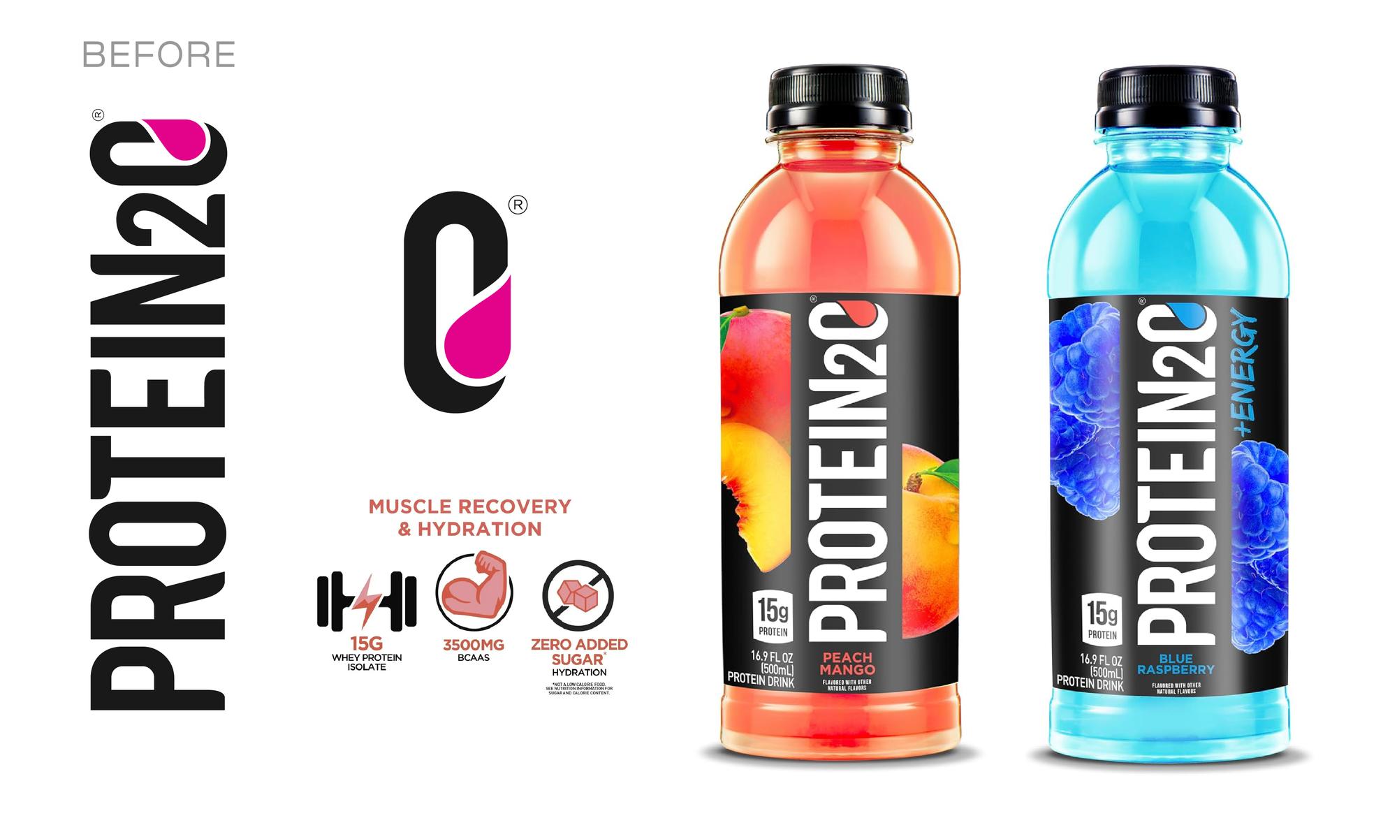
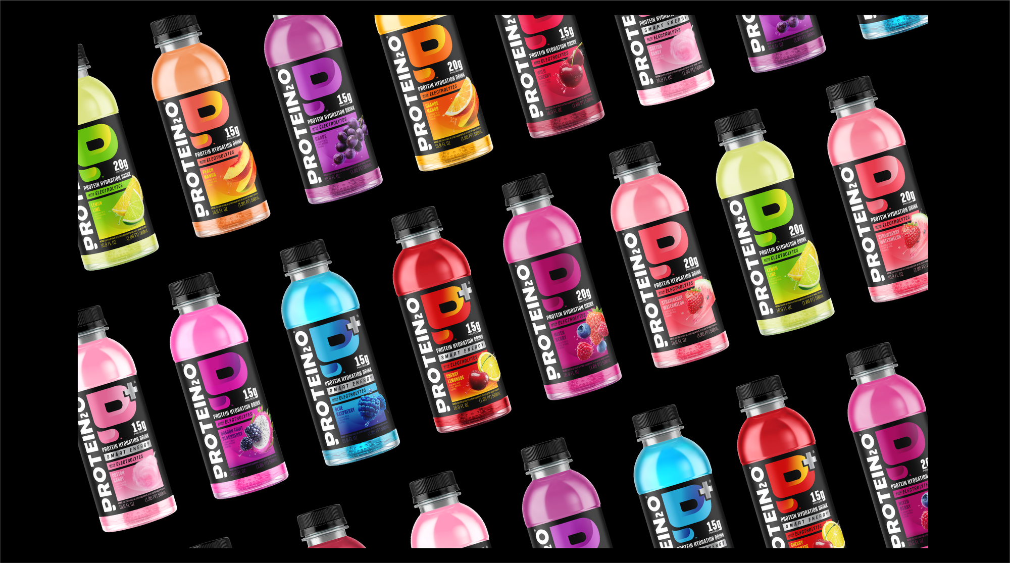
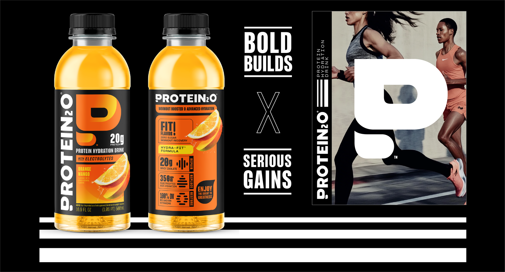
Solution
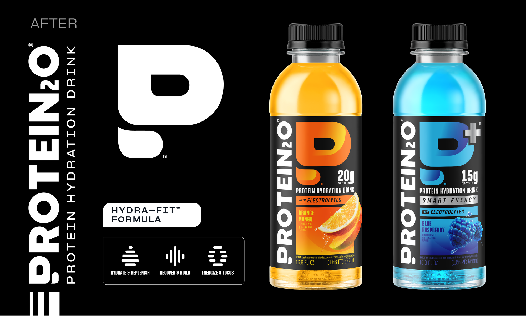
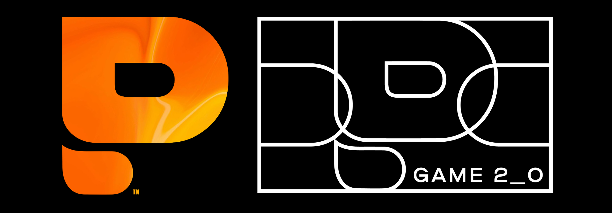
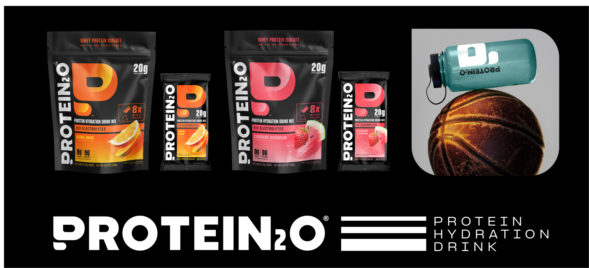
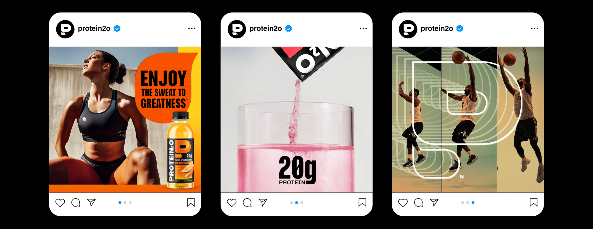
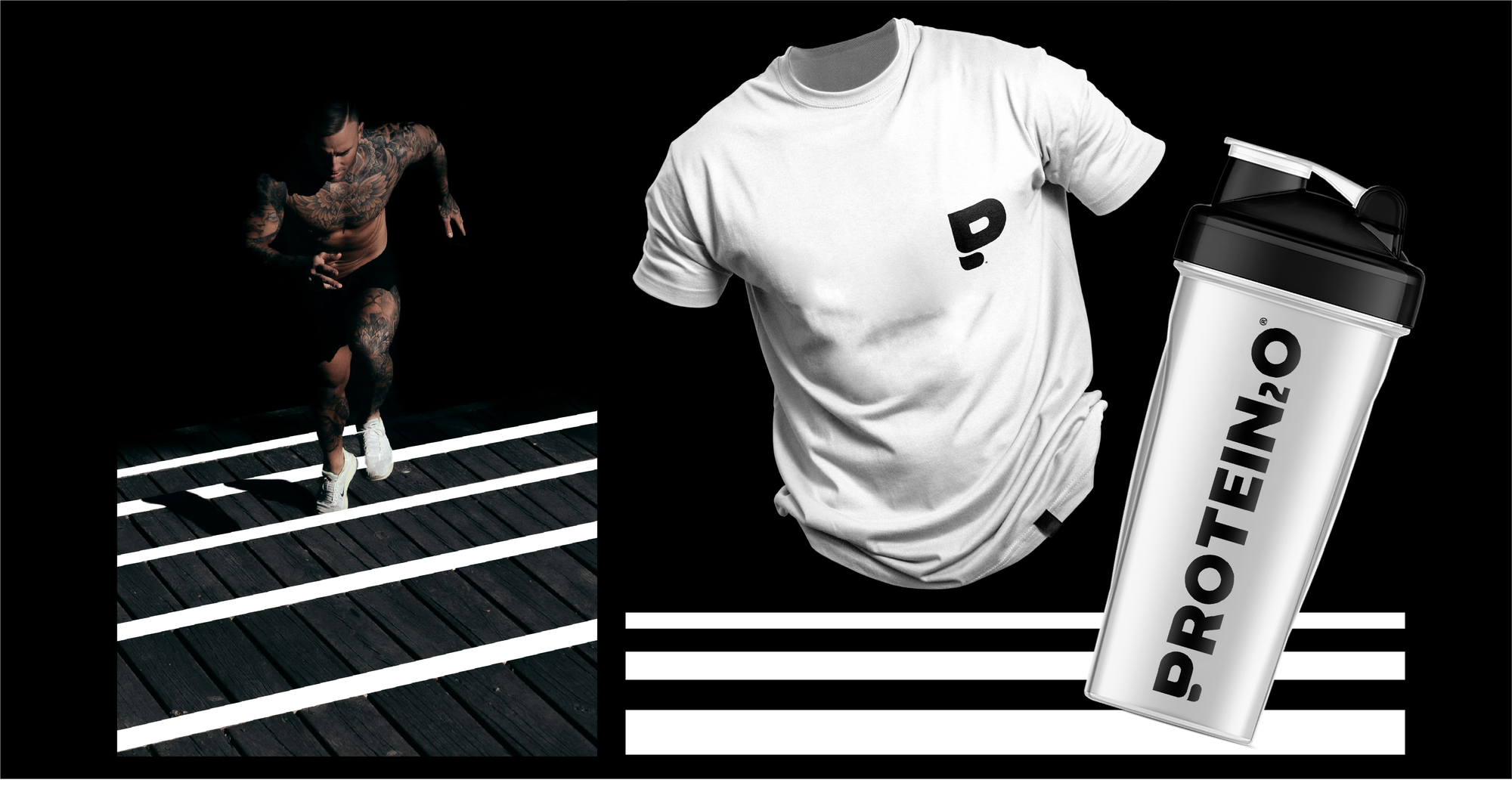
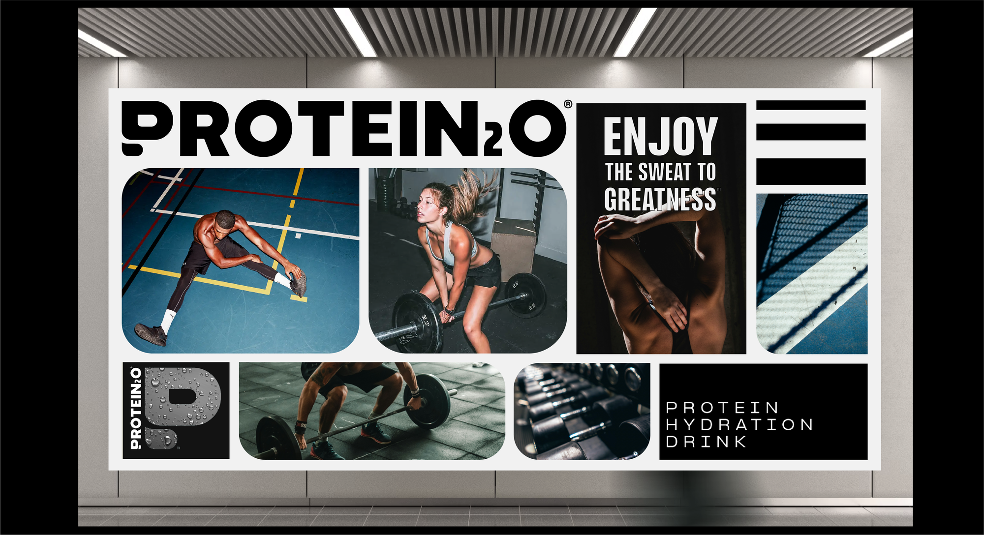
To shed its private label, juice aesthetic for a whole new world that could deliver a more refreshing, iconic, and ownable perspective on sport-driven hydration. Along with re-drawing the challenging long-form logotype for better legibility, we developed a new iconic mark: a bold refreshing P that could boldly express the tasty and tactical transformation that occurs when using the product.
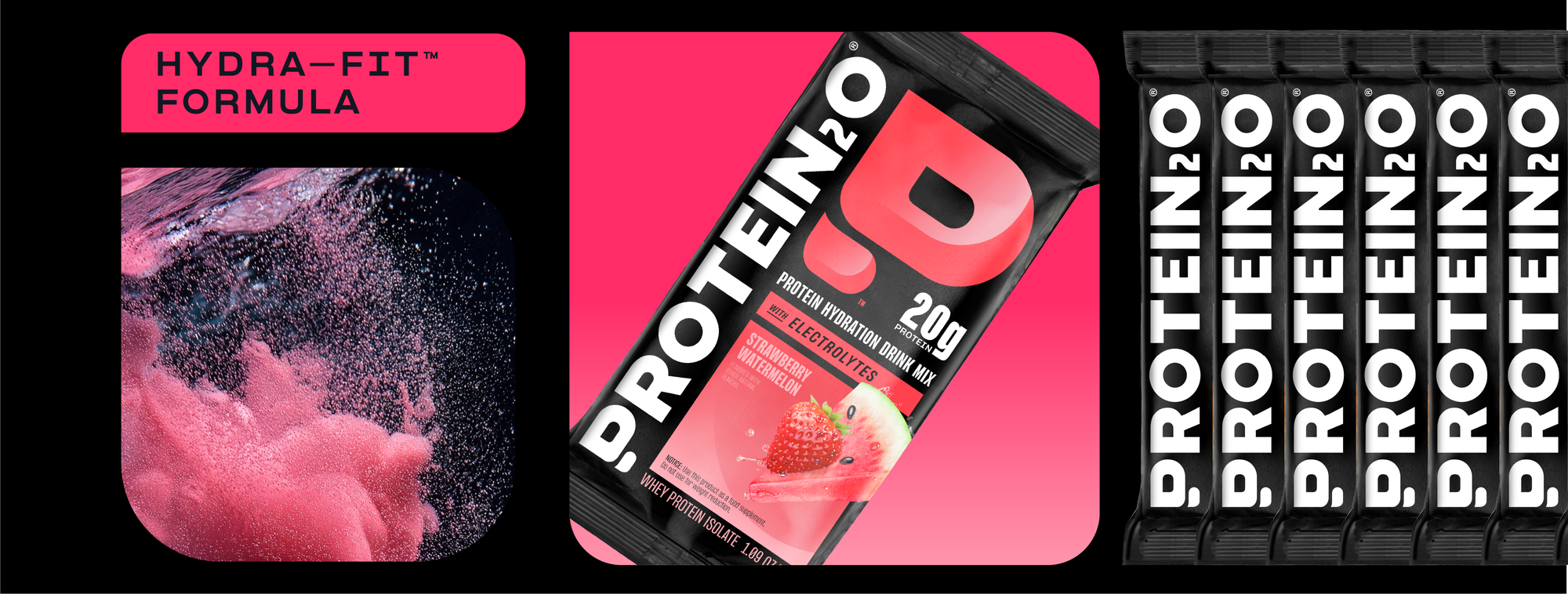
A strategic new packaging architecture now allows for effortless flexibility and extension amongst various formats, with simple ways to celebrate and segregate between the various RTB's of each range. A support suite of icons and tone of voice is now available for the brand team to celebrate the sport science and efficacy of each product.
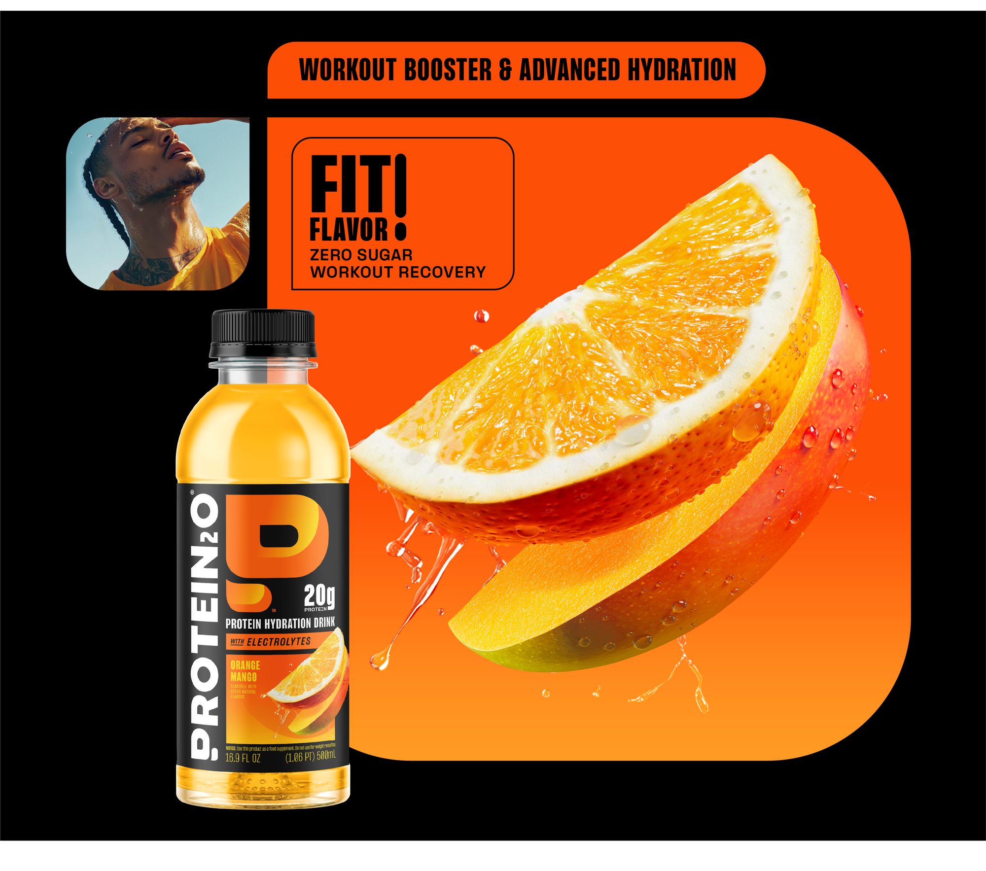
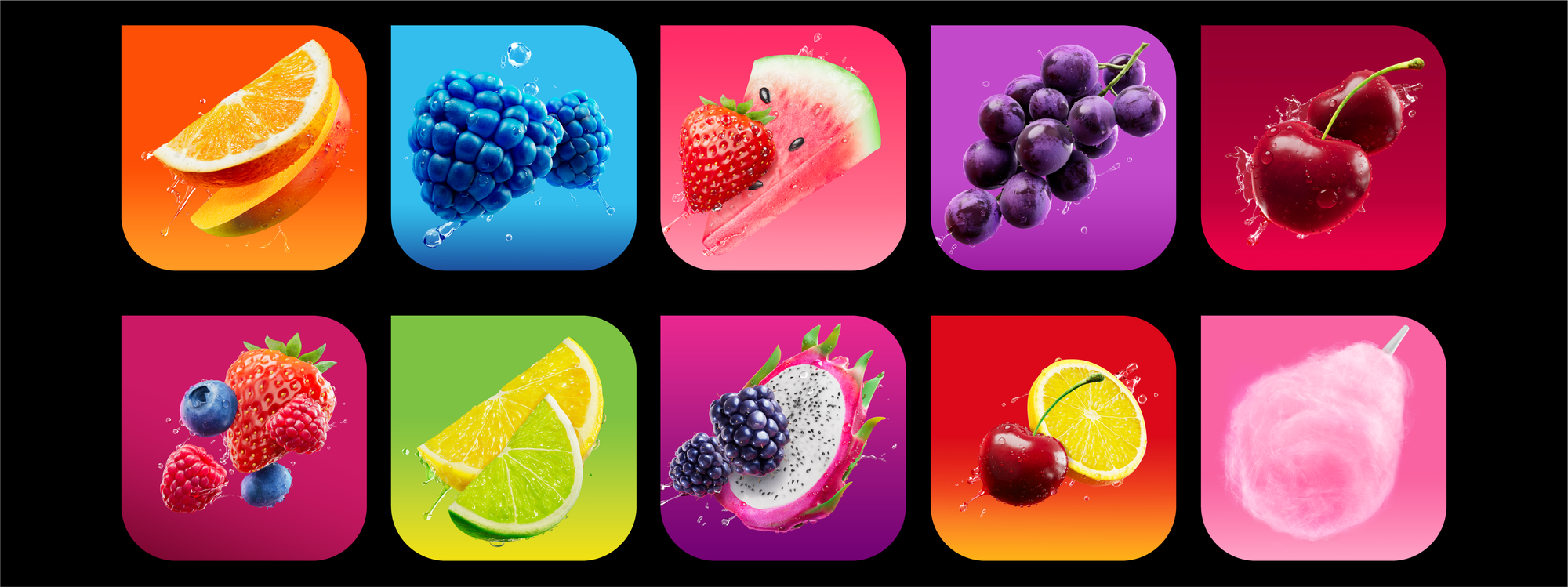
Finally, we gave them a more refreshing, cohesive style to present ingredients and flavors: a caught in motion photographic illustration style that could boldly celebrate the taste value of each variant.