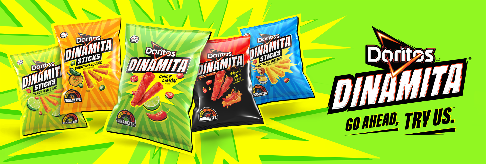
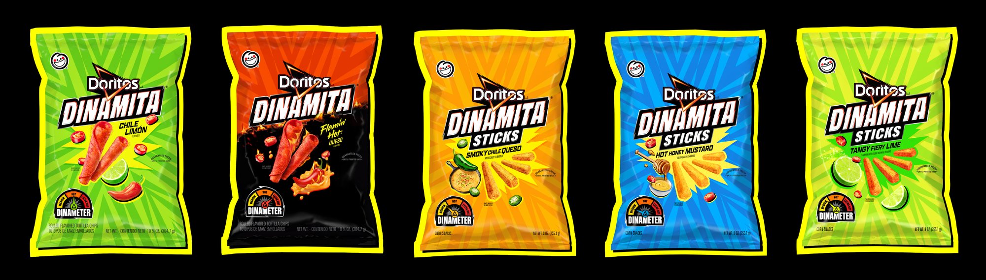
Challenge
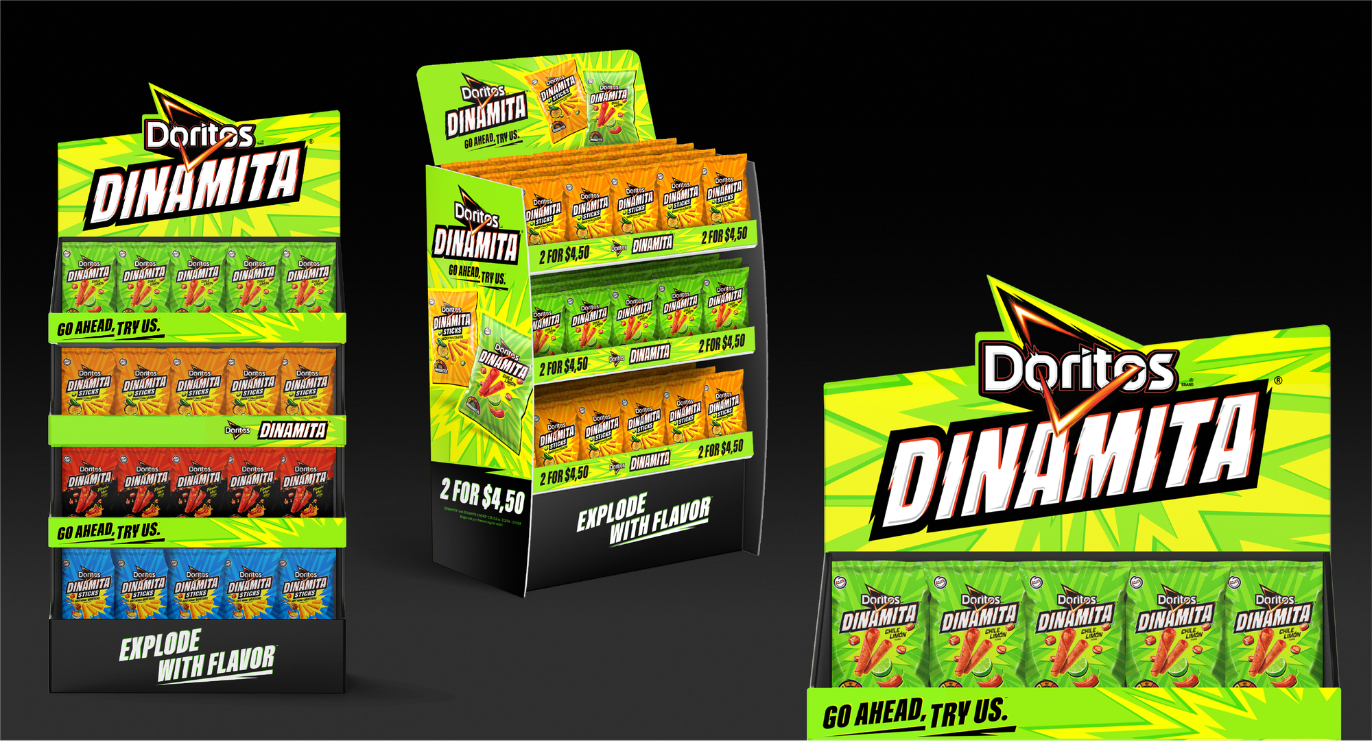
To evolve Dinamita into a true sub-brand of DORITOS with not only a revised core identity, but a hyper-flexible packaging architecture that could support the adoption of multiple product formats. Furthermore, to create an explosive core look that could ensure more market share on shelf, as well as a buzz-worthy relaunch — all to place Dinamita amongst the new taste of America's hot 'n' spicy snacking culture.
Solution
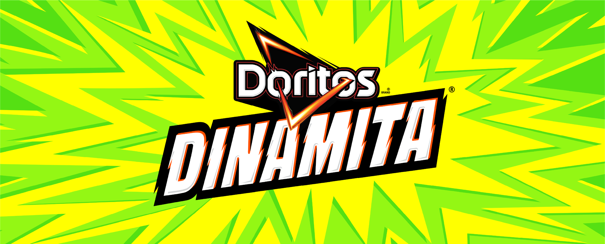
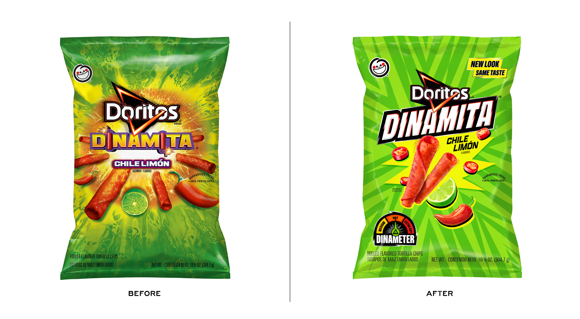
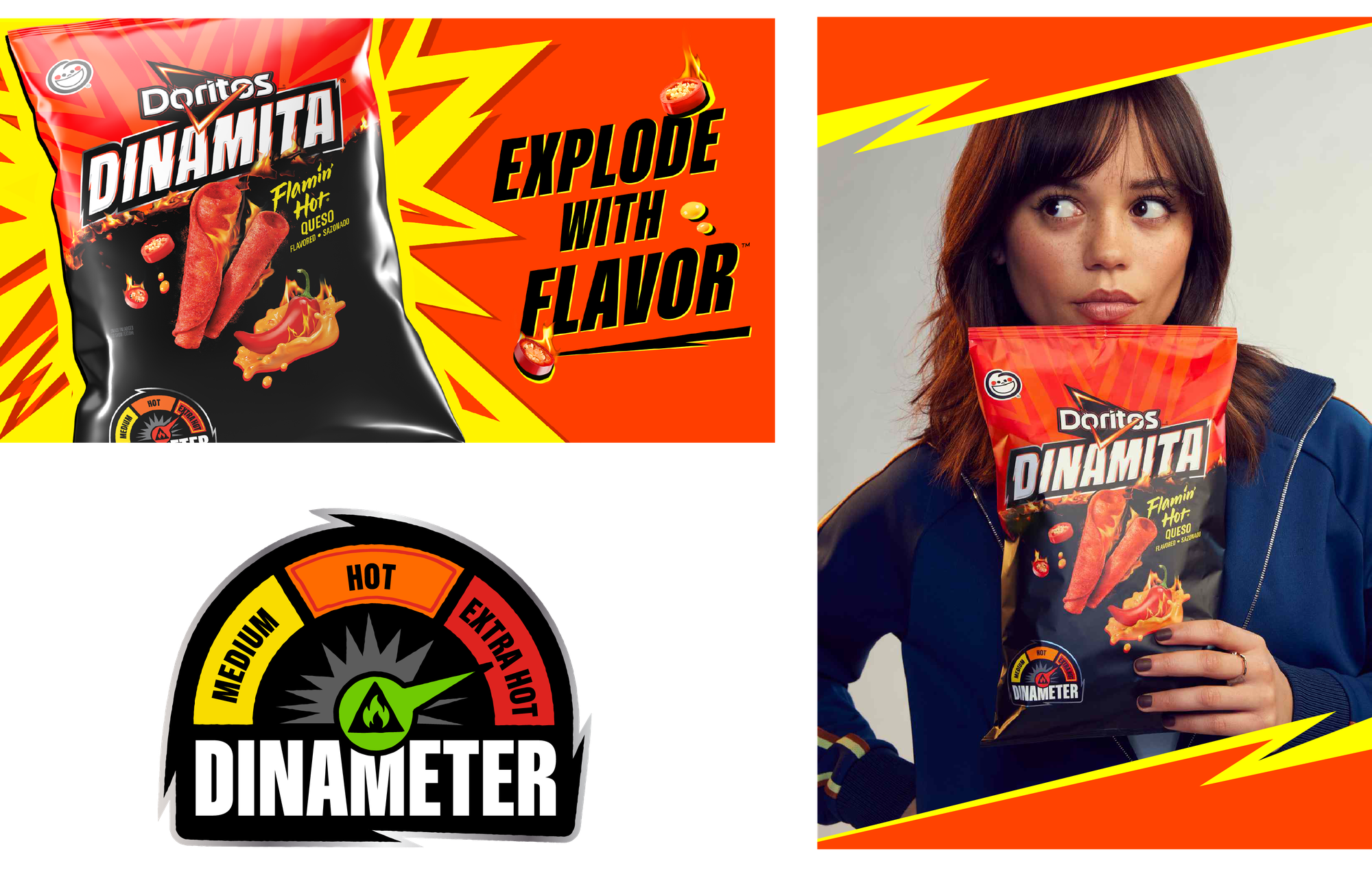
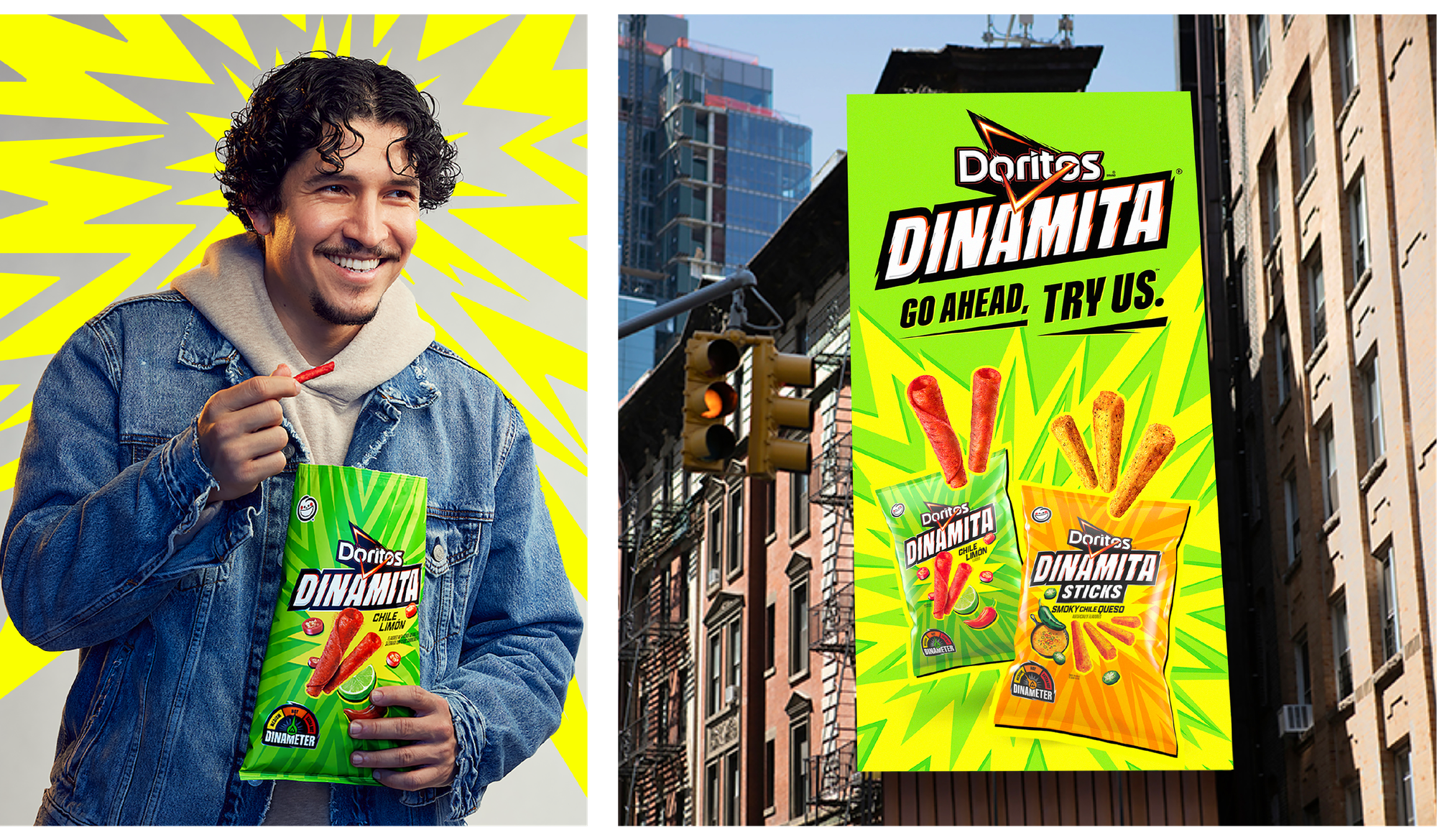
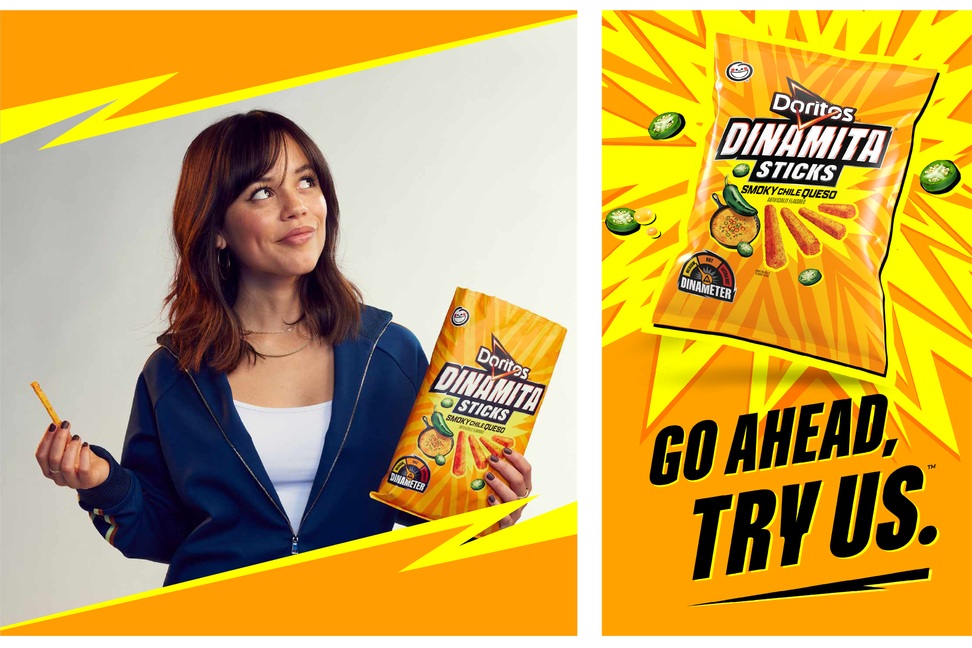
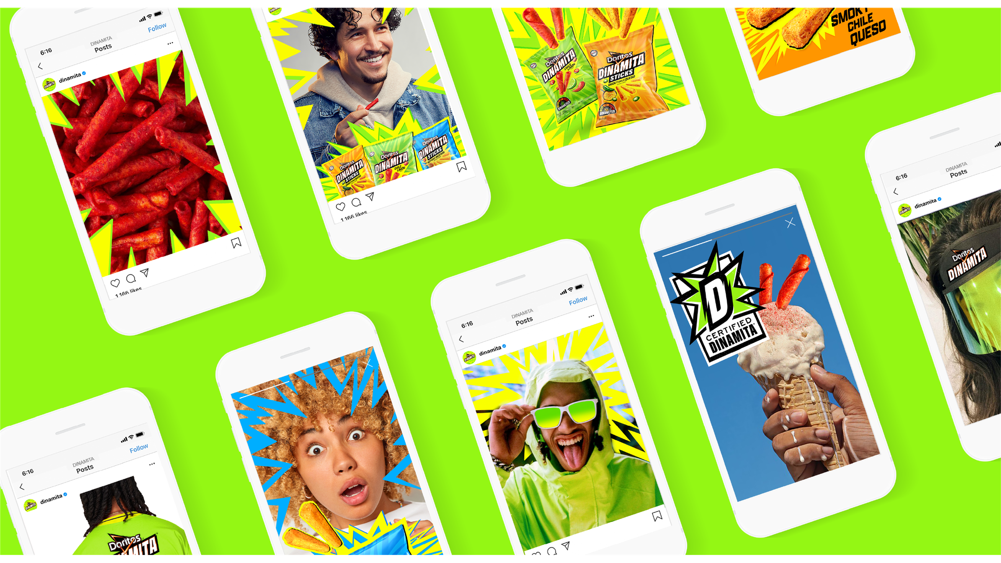
Safari Sundays partnered with PepsiCo Design & Innovation team to shift Dinamita's identity from icons of danger to positivity — from literal sticks of dynamite, to an explosive release of intense heat and flavor.
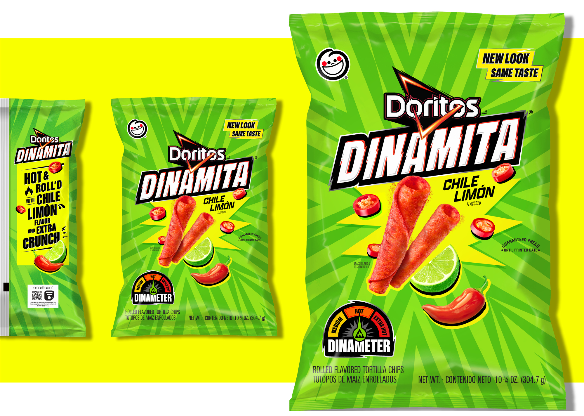
The result is an impactful logotype that not only expresses the electric crunch and dynamism of the flavors, but has fills, finishes, and forms that now connect closely to the DNA of the Doritos parent brand. The core explosion burst and supporting pattern-work allow for each of the five SKUs in the family to celebrate their own flavors with bespoke depth and intensity.
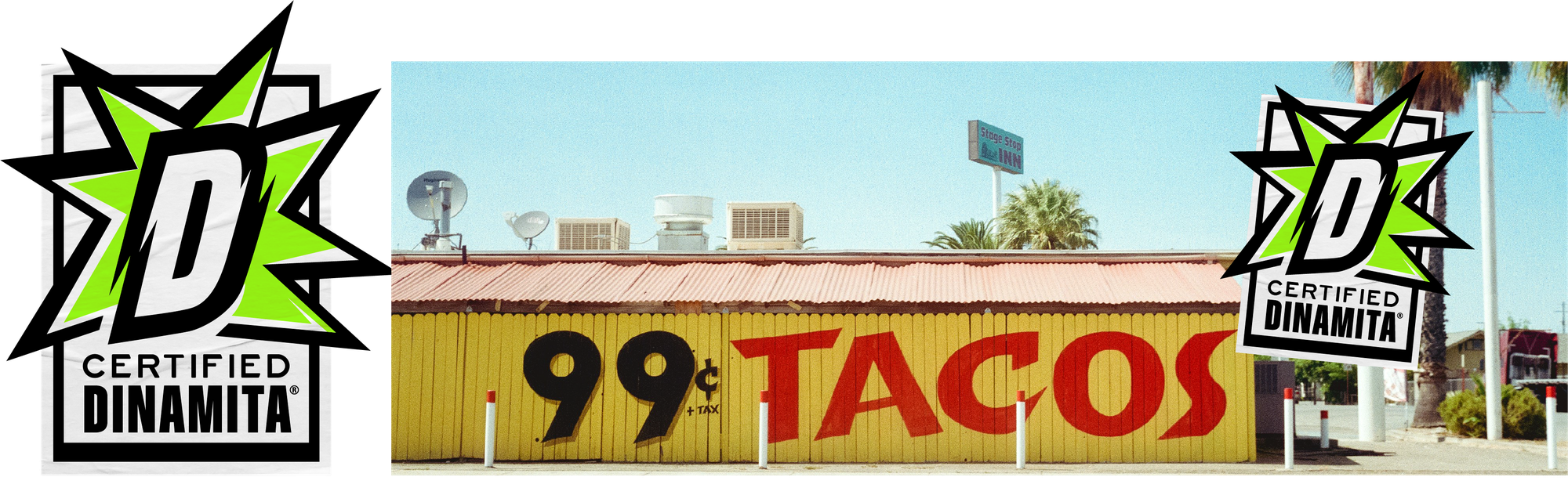
Special on-pack additions like the newly conceived DINAMETER help emphasize and navigate the heat levels of the products. Along with the cohesive off-pack brand world, the team created a CERTIFIED DINAMITA seal to build a pathway to celebrate the hot 'n' spicy mindset amongst loyalists and creators at large.